Peter:
As Lead Product Designer at Fide—a professional platform shaping the future of work—I designed a new iOS app and accompanying web experience. The product enables professionals to build meaningful industry and interest based communities, while enhancing job discovery through innovative Agent-to-Agent Synthetic Interviews.
In addition to leading design, I played a central role in unifying the company’s efforts across product, marketing, strategy, people, and engineering. I aligned product vision and roadmap with our CEO, helped shape our brand and GTM strategy with Marketing, and partnered with Strategy to drive user insights and refine our AI roadmap.
[Onboarding & NUX]
Reducing initial time to value
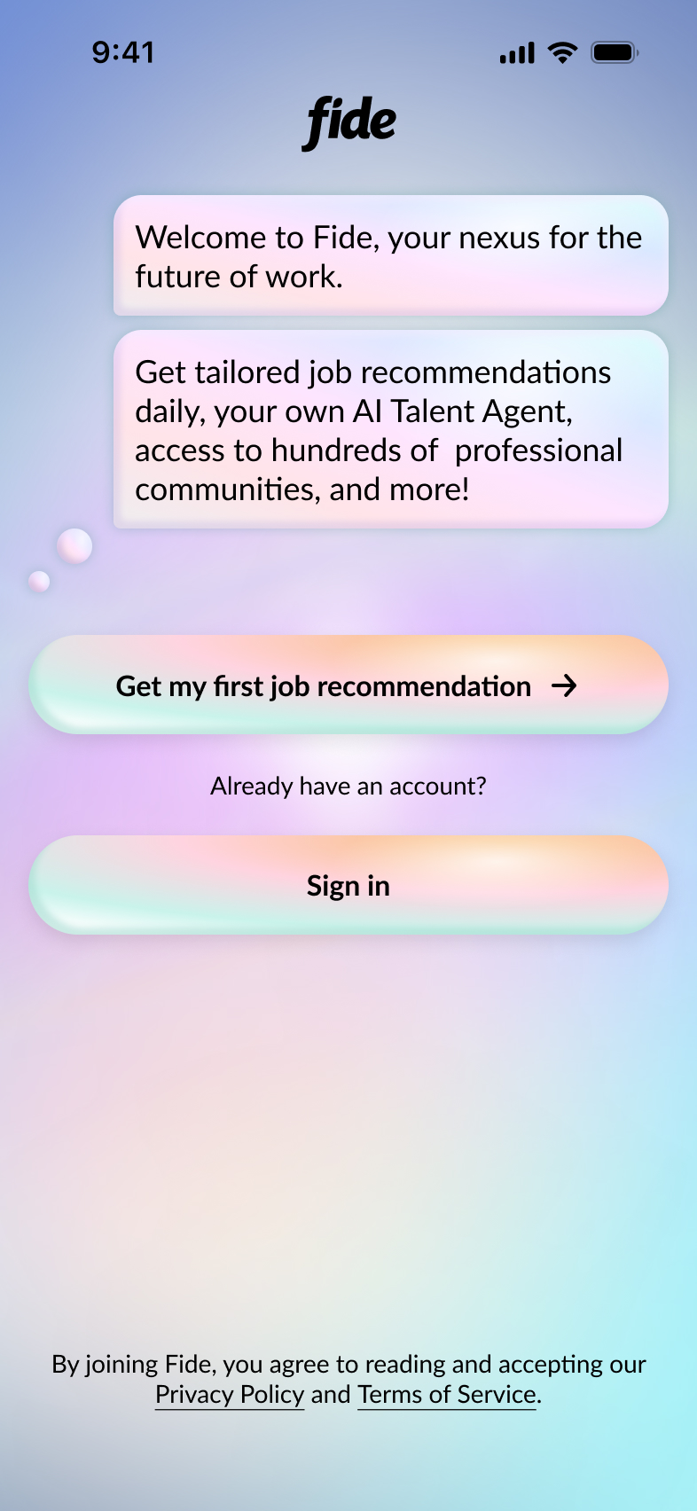
** THE PROBLEM **
As a new product, earning user trust was critical. We focused on doing this by delivering clear, immediate value and guiding users through a streamlined experience centered on a single core objective. User feedback revealed that many felt overwhelmed by the app’s complexity and unsure of what to do first. This confusion was reflected in our new user retention metrics. To address this, we needed to clearly communicate the value of Fide early on and design an intentional path that helped new users understand how the product worked—while giving them a compelling reason to return.
Previously, the new user experience required an in-depth onboarding flow to fully build out a profile before users could access the product. Once complete, users were placed into professional community channels, matched with another member via direct message for networking, and contacted by their personal AI assistant—all at once. For many, this was confusing and they did not know which feature was right for them. Some users never completed onboarding because the benefits were unclear, while others dropped off shortly after entering the app, unsure of what to do next.
** THE SOLUTION **
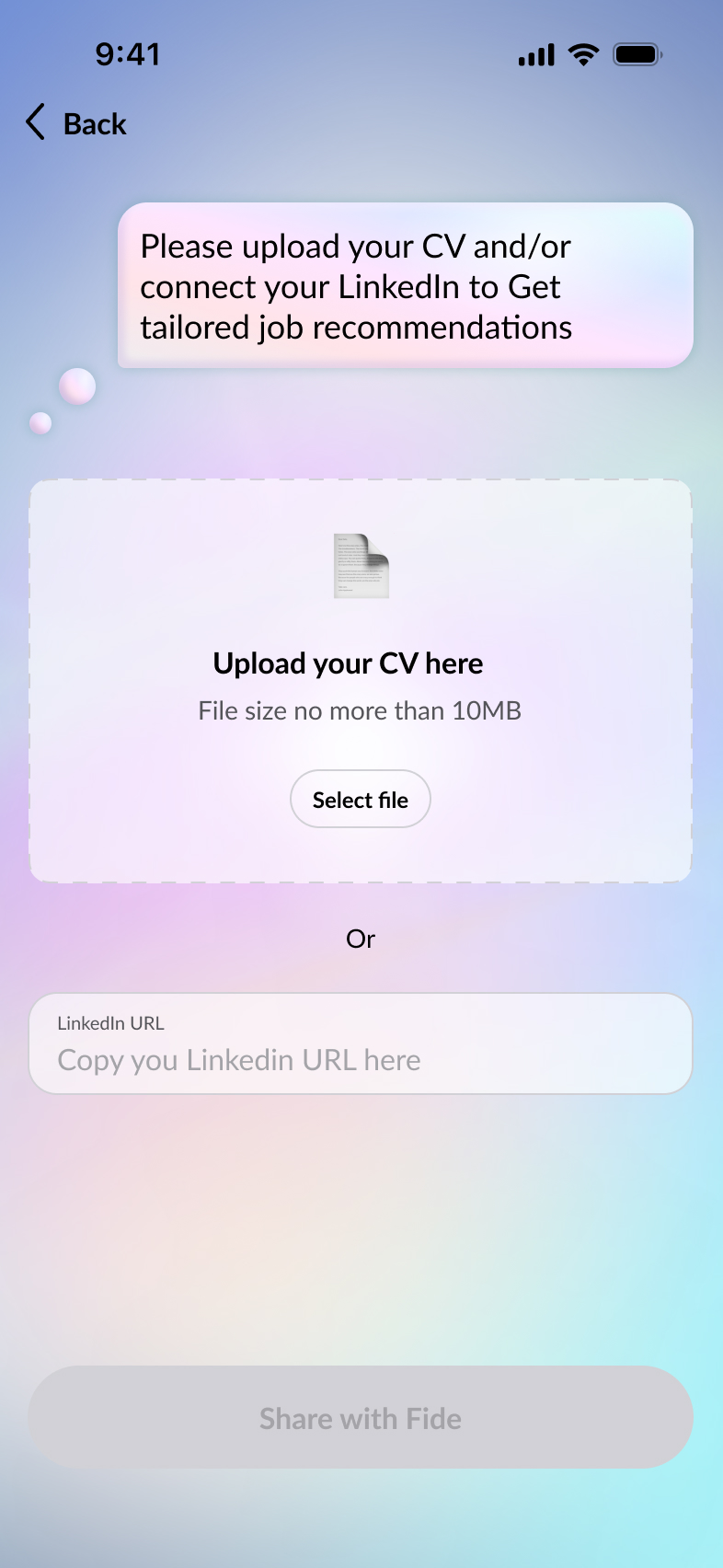
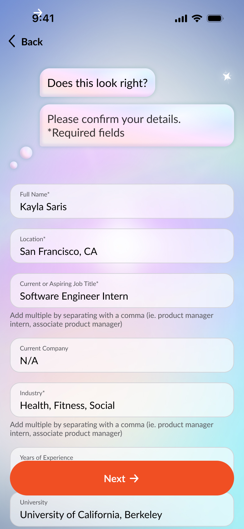
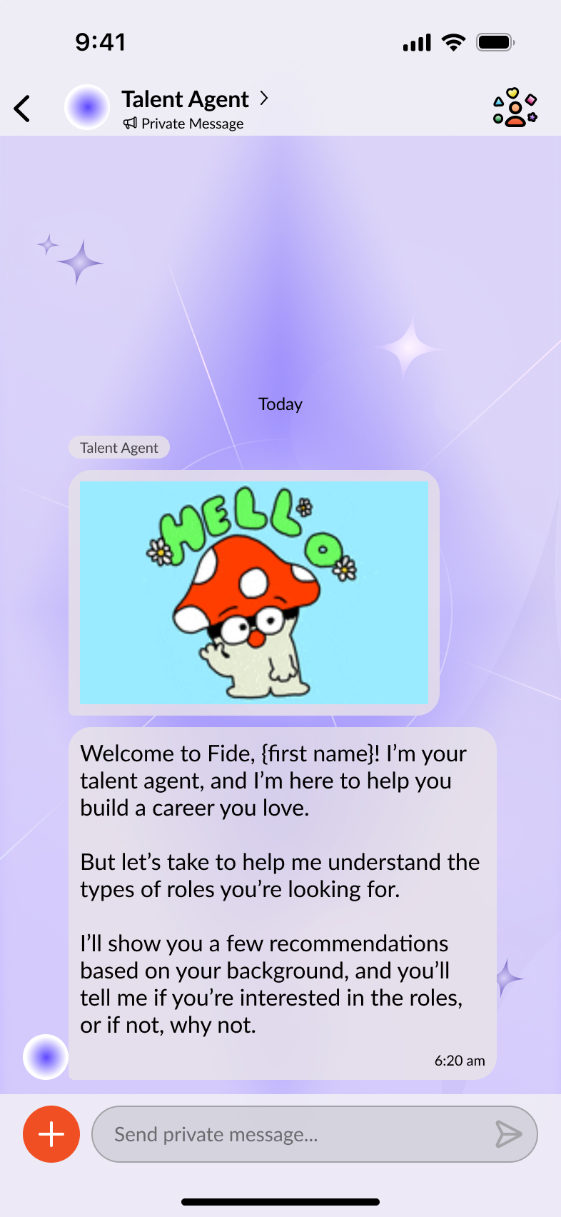
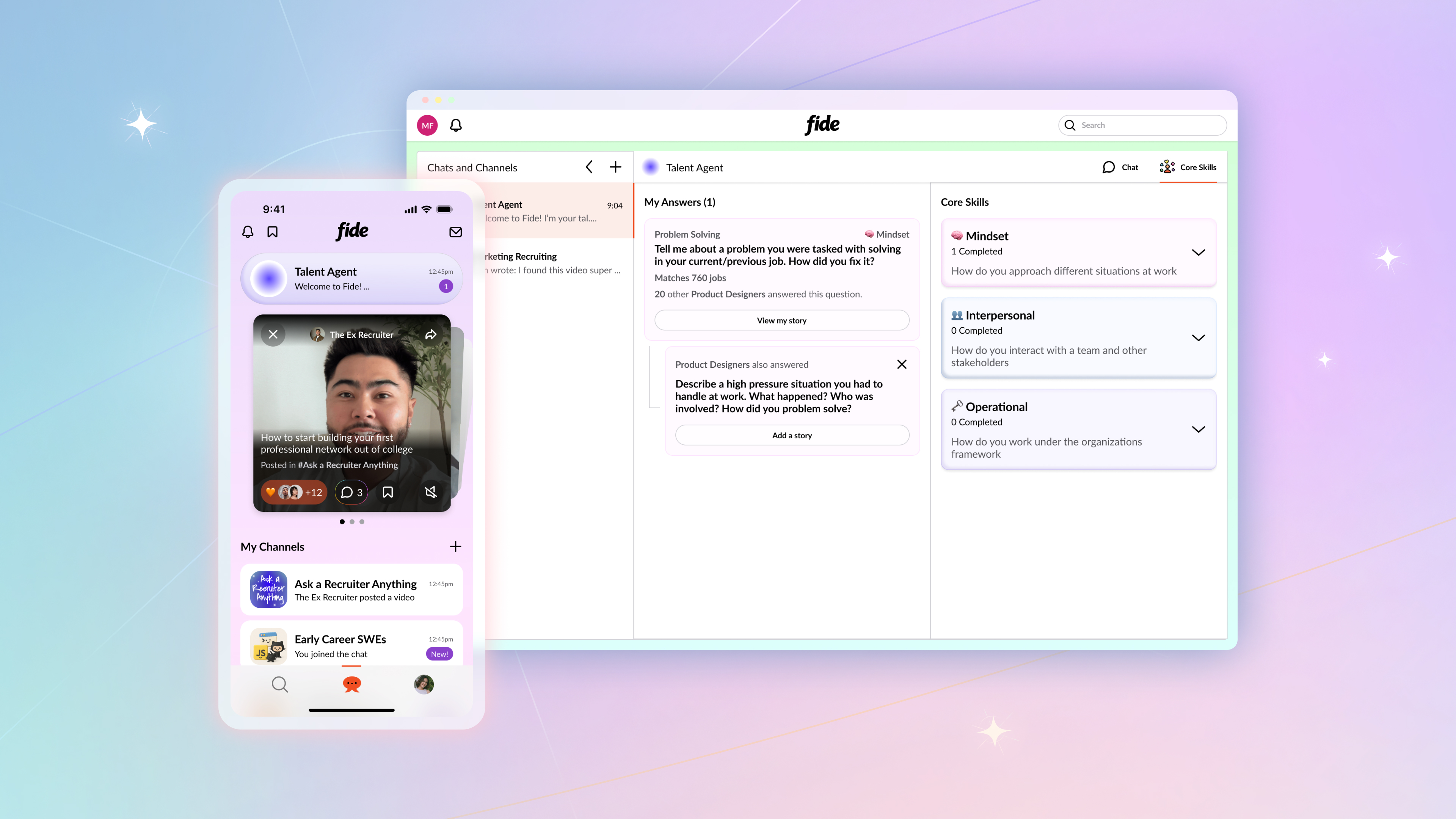
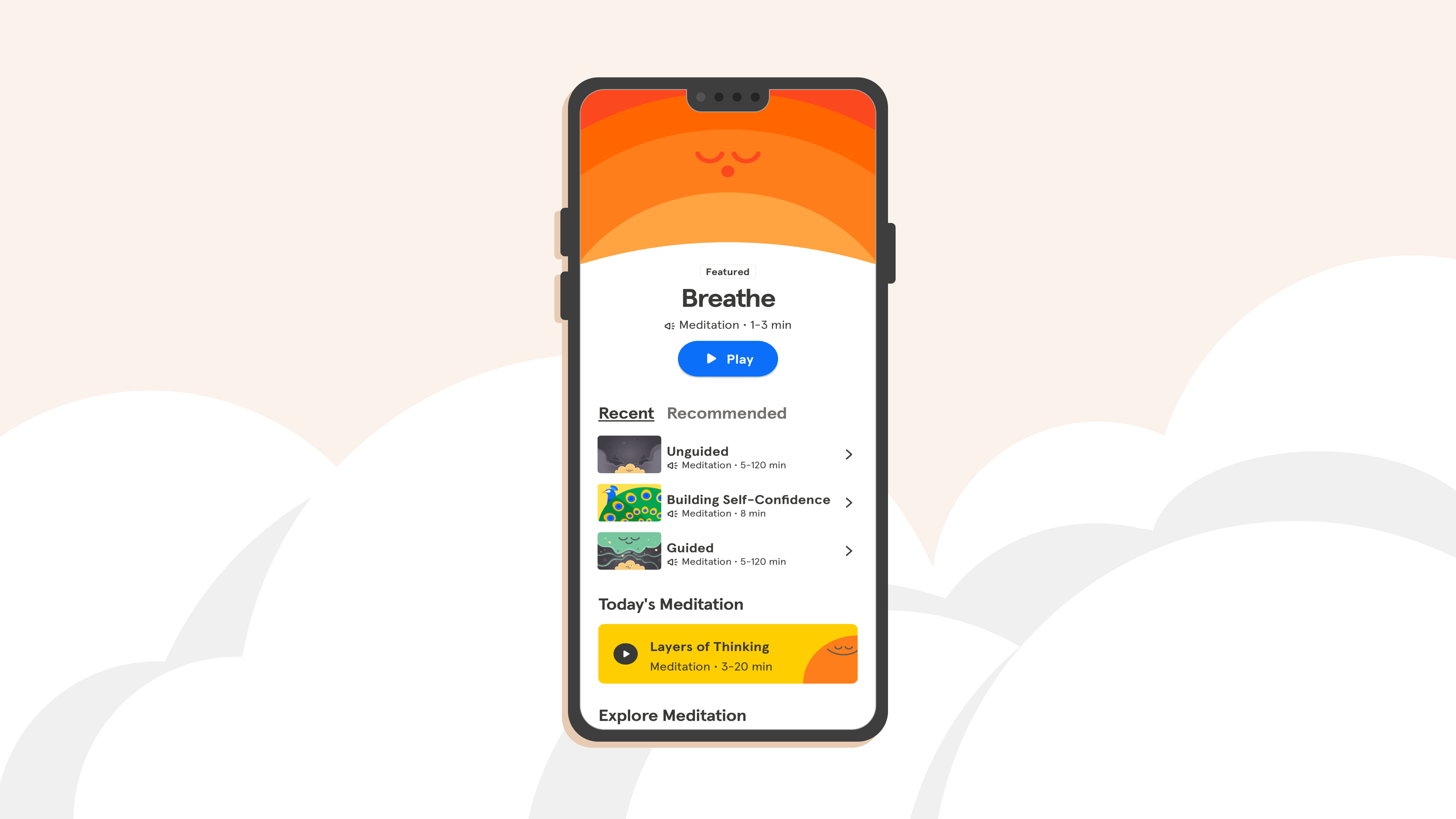
While many of our users said they liked the professional communities and networking aspects of Fide, their highest priority was finding a job. So we decided to focus of job recommendation as the first path for our new users. To reduce friction, we introduced a "Guest Account" flow where users could simply upload a CV or connect their LinkedIn. This allowed us to delay full profile completion until they had already received a personalized job recommendation and better understood the value of Fide.
[Simplified onboarding on mobile]
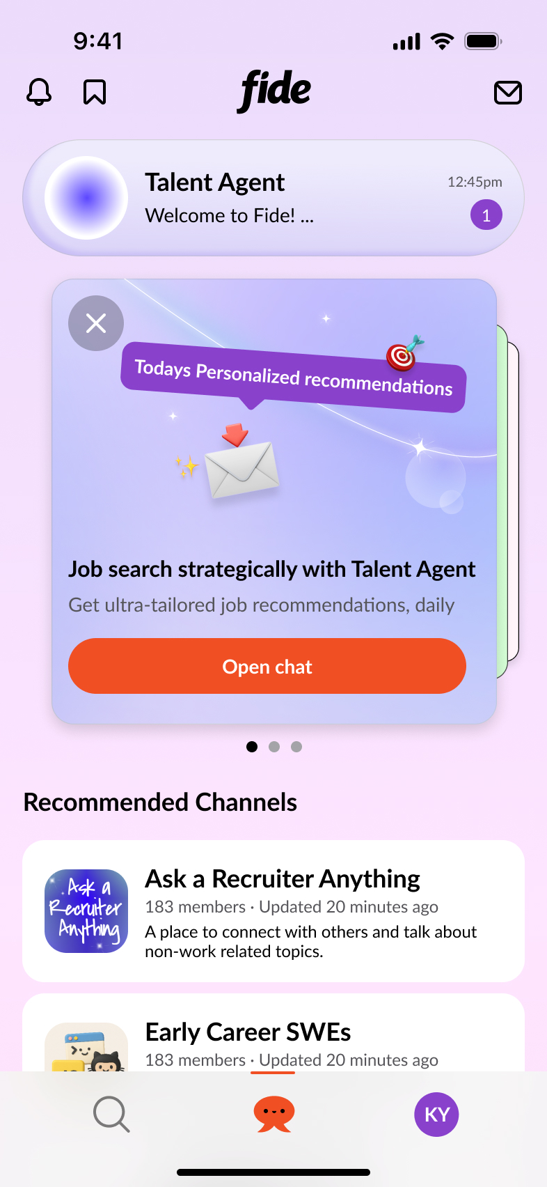
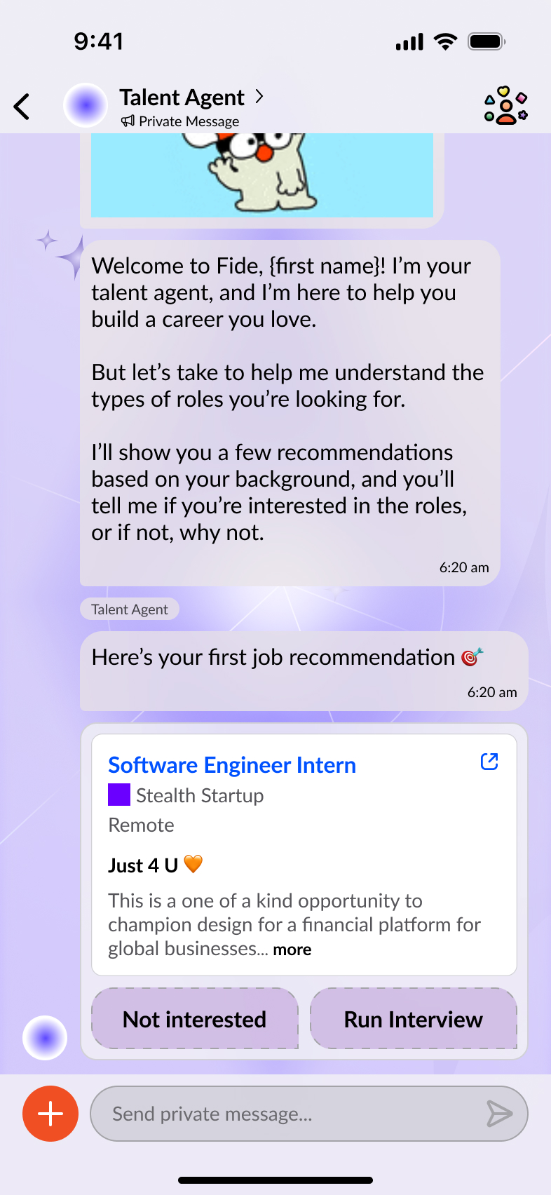
Once onboarding is complete, users are welcomed by their personal AI Talent Agent, along with their first curated job recommendation. The Talent Agent becomes a long-term career companion, learning the user’s strengths and ambitions and guiding them to the most relevant opportunities, content, and communities on Fide.
[Talent Agent Chat on mobile]
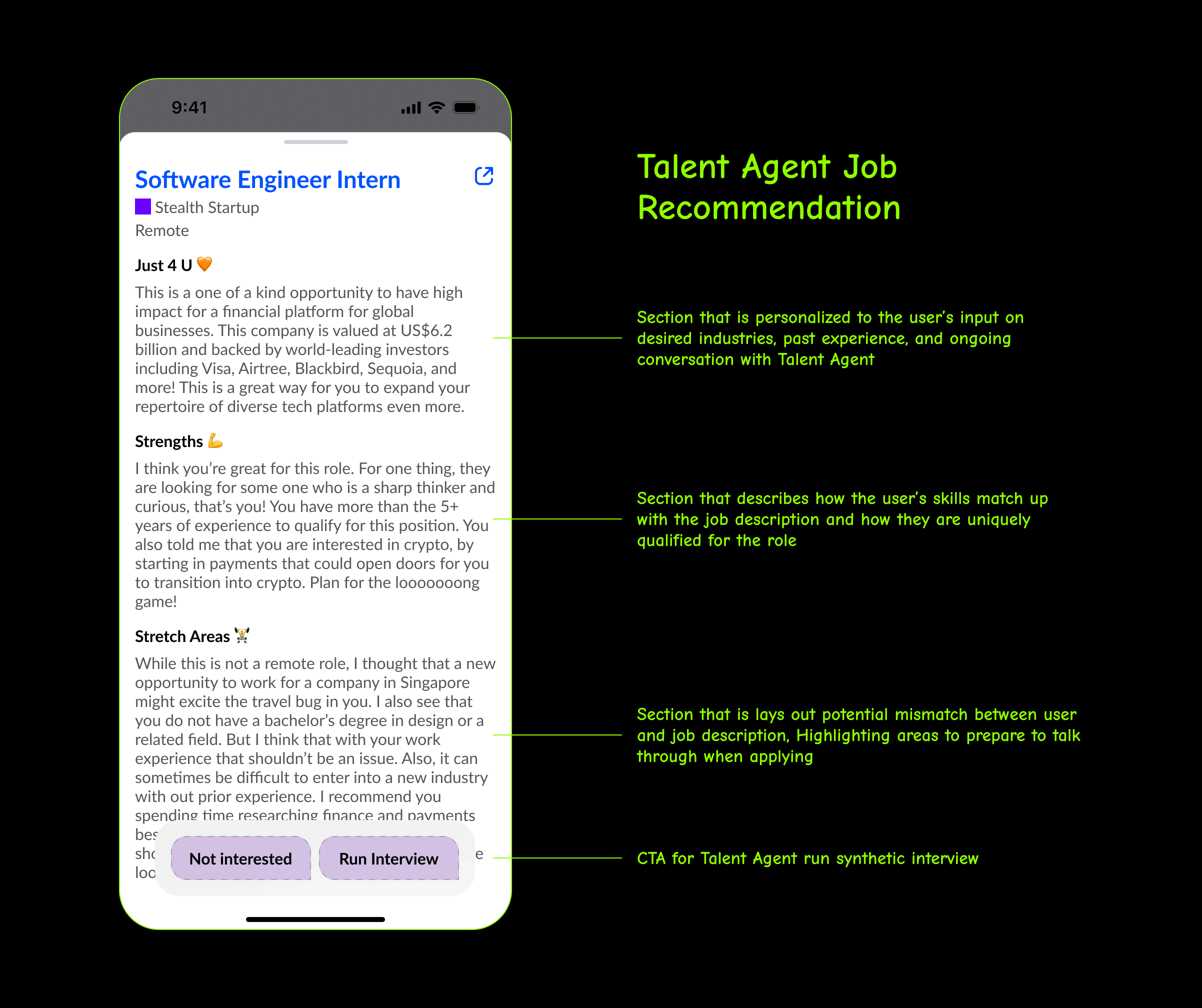
[Expanded view of job recommendation and sections breakdown]
Once users begin their first synthetic interview, we explain how their Talent Agent becomes a stronger personal advocate the more they interact with it.
[Education modals on mobile]

[Guest Sign flow in on Desktop]
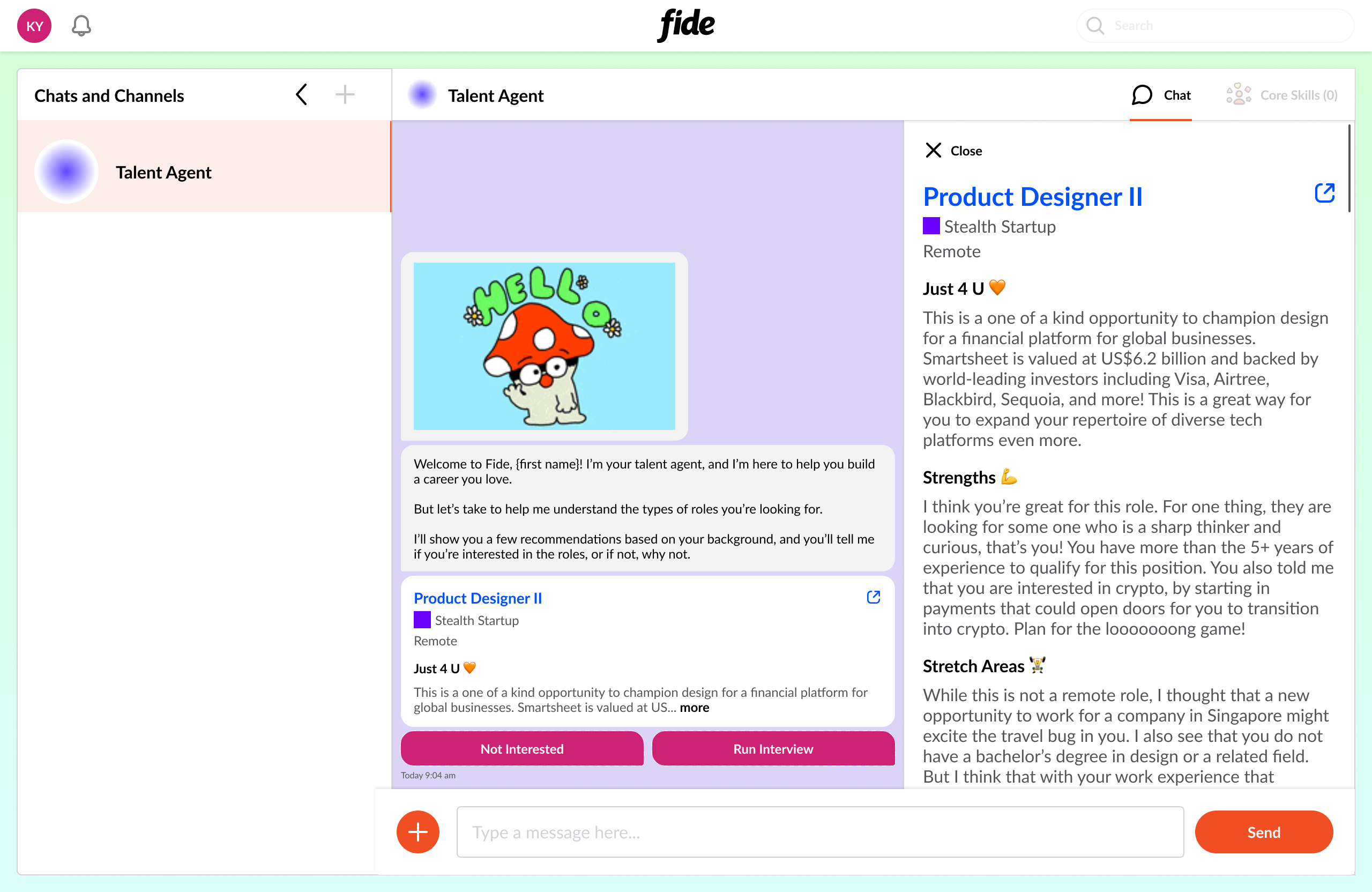
[Expanded view of job recommendcation on Desktop]
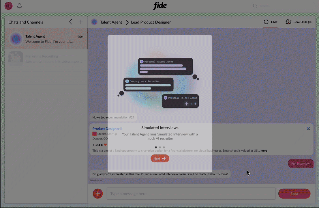
[Education Modal explaining Synthetic Interviews]
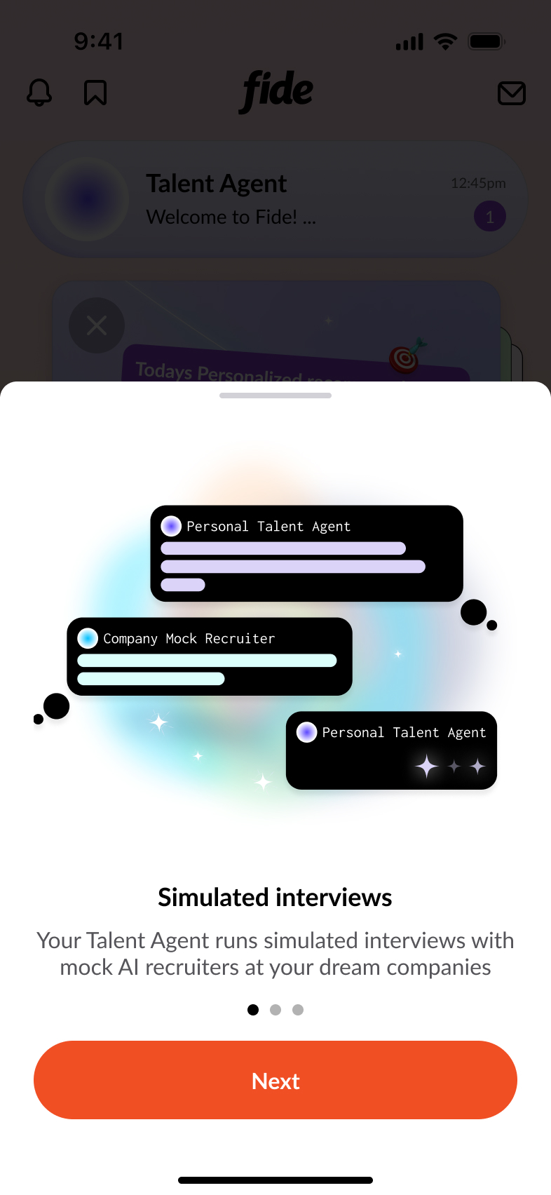
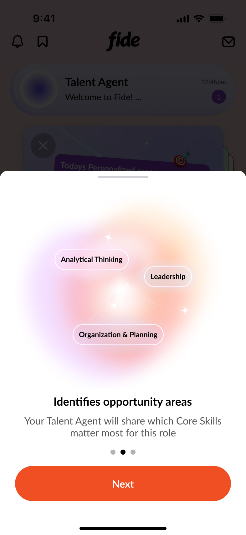
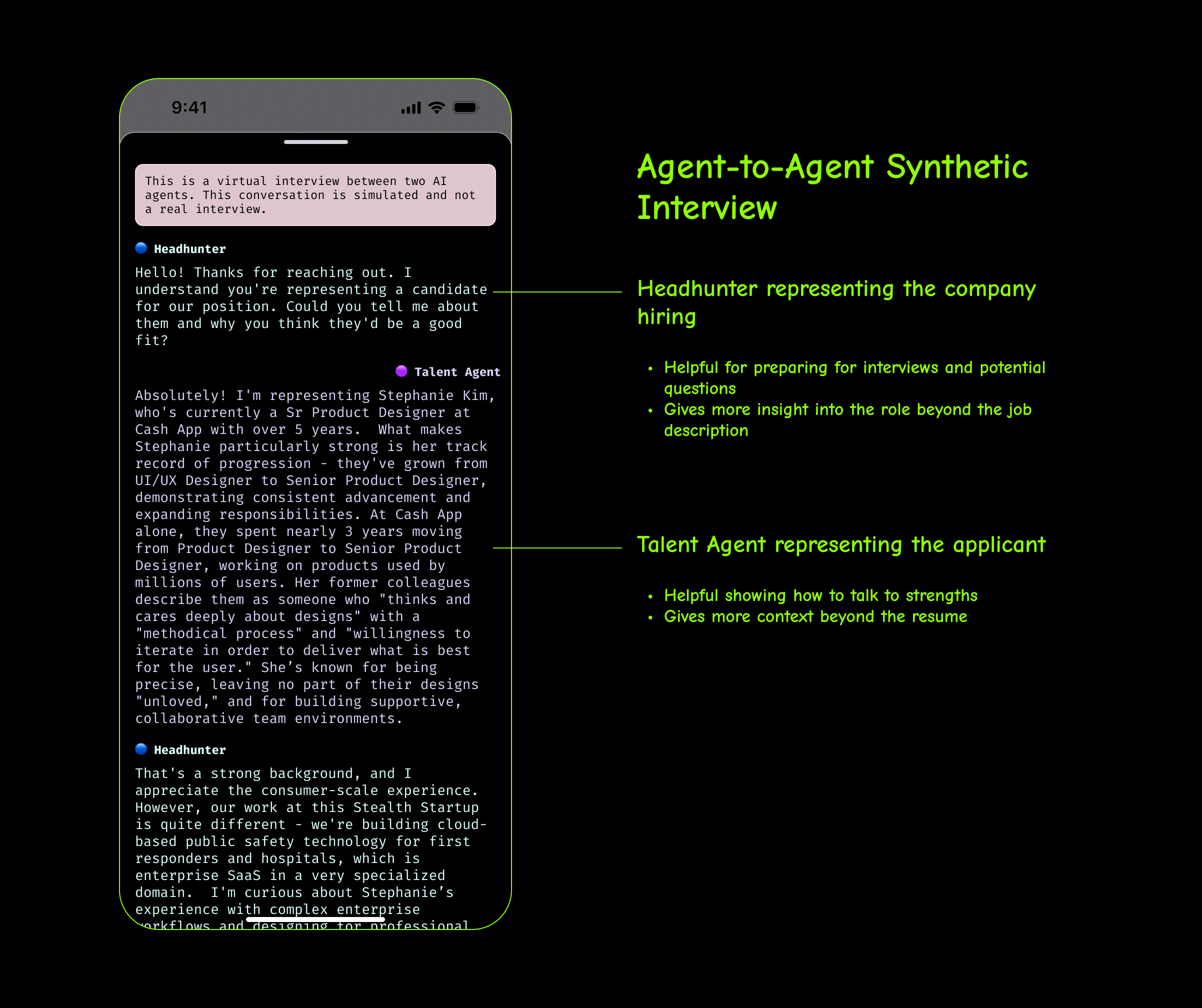
Agent-to-Agent Synthetic Interviews
When a user clicks "Run Interview" a simulated interview begins between two AI agents. The Talent Agent represents the candidate, drawing on information from their resume and past conversations. The Headhunter represents the hiring company and, in some cases, is trained using input from recruiter partners to reflect specific team needs and company priorities. Partner examples included TLDR and RPA for marketing and advertising roles.
[Breakdown of Synthetic Interviews on Mobile]
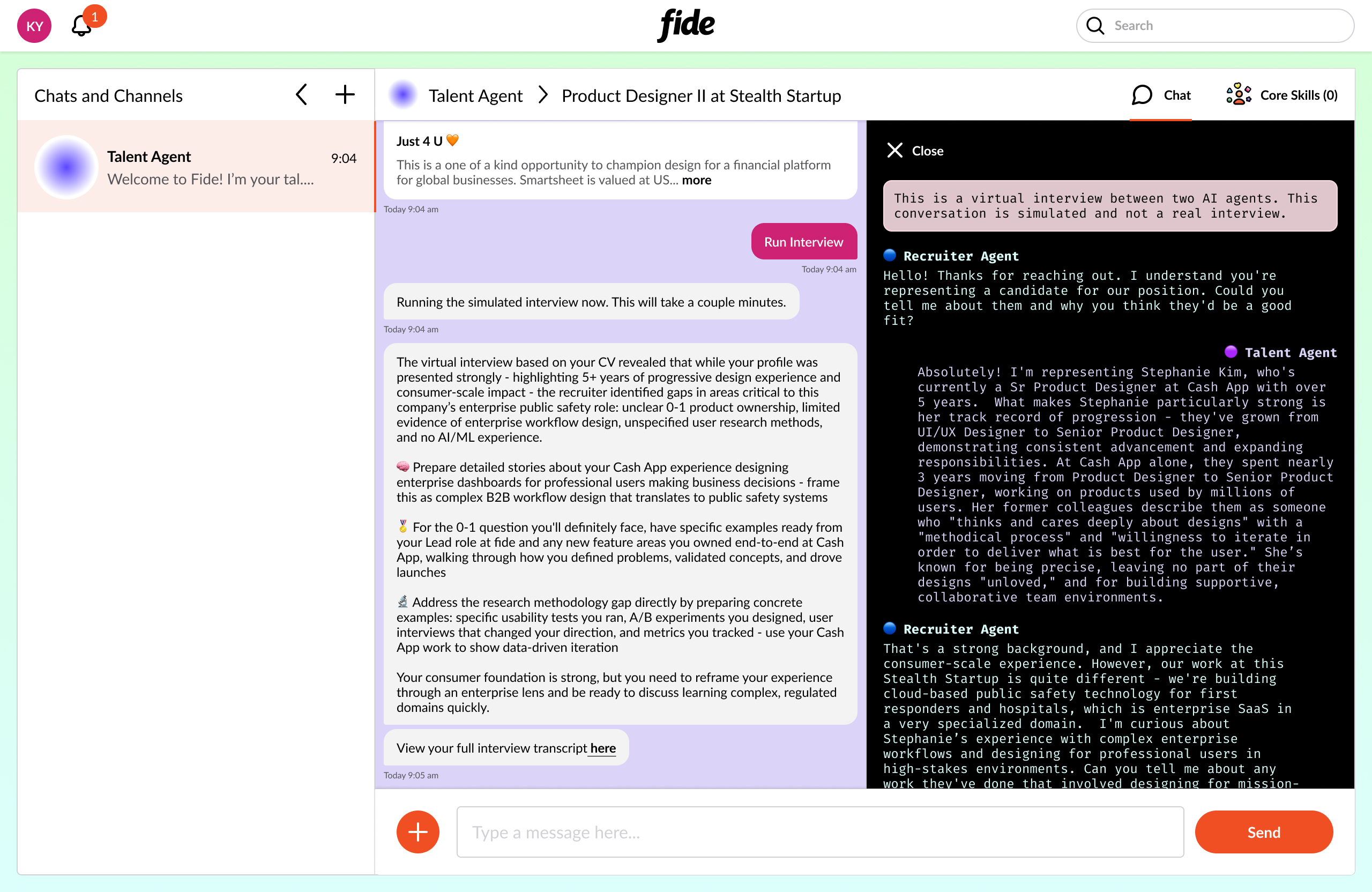
[Full transcript of the Synthetic Interview on Desktop]
Users consistently told us they felt frustrated and discouraged by the current job market. Many described submitting countless applications that seemed to disappear into a void, with little to no feedback on how to improve. By introducing "Synthetic Interviews" we gave users structured, actionable guidance—helping them understand where their applications fell short and providing clear, practical next steps to improve their chances.
[The Future of Hiring and Job Search]
Robust professional profiles that go beyond the resume

More coming soon...
Peter:
I worked at Tinder from January 2020 to September 2022. During my time there I worked on the Revenue team and Growth team and worked on a wide variety of projects ranging from a new subscription tier to a notification center to a multiplayer swipe experience. I was also promoted from a Product designer to Senior Product designer where I began to manage junior designers, play a crucial role in the feature ideation phase with the product team, and larger design team activities. I am so thankful for my time at Tinder and feel like I grew so much while working there, not just as a designer but as a human. I was able to work with amazing people and learn from powerful, caring female leadership ^-^*
[PROJECT 1]
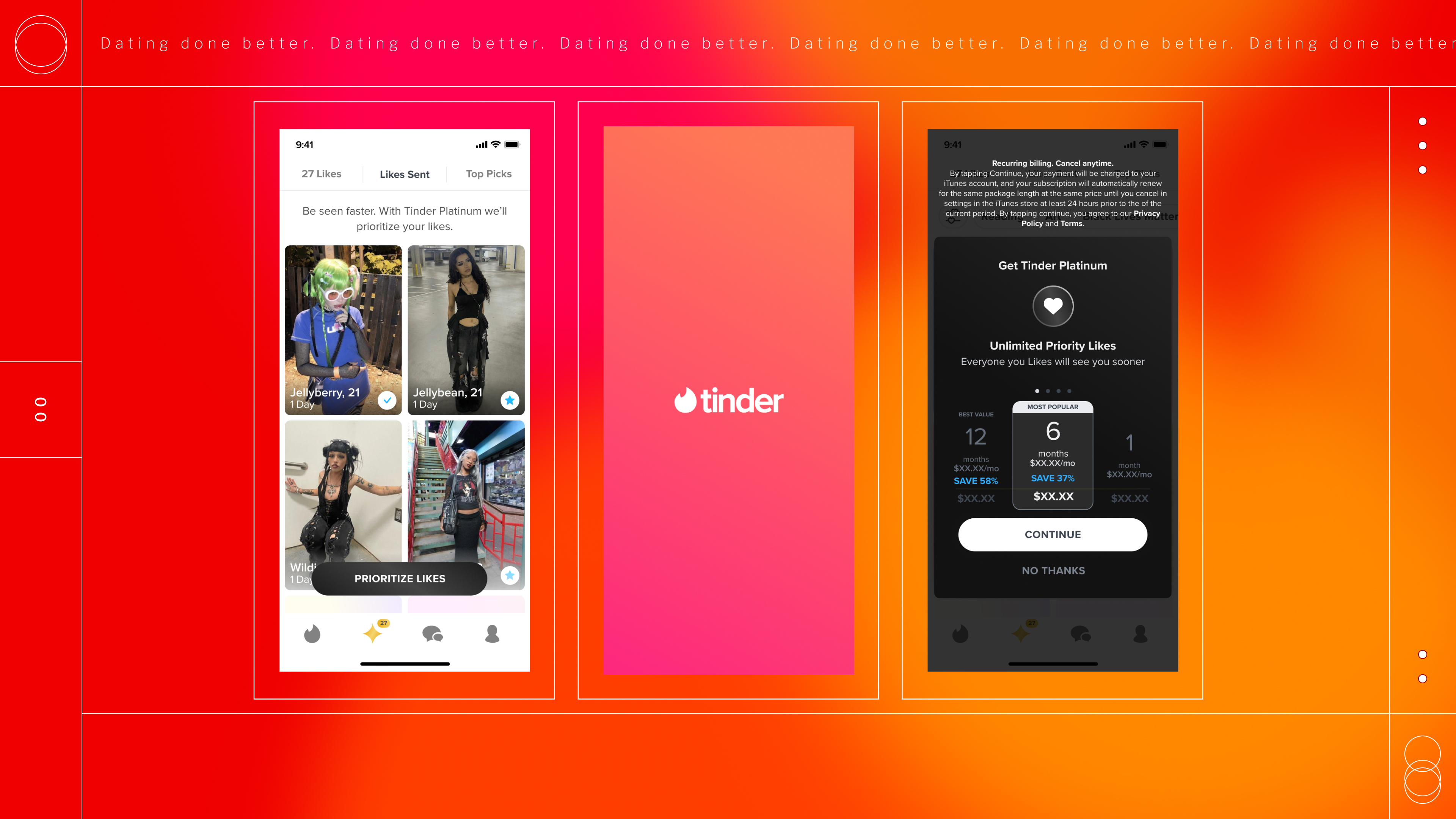
Tinder Platinum
The first project I worked on at Tinder was building a brand new subscription tier called Tinder Platinum. We wanted to provide a premium service for some of our highest intent users who, might otherwise, still struggle on the app. We created a new set of features that would level up the most crucial actions a user could take on Tinder to help lead to a higher success rate at meeting up with your matches in real life (which was what our users expressed to us as being the most important thing for them).
We interviewed users and conducted large scale research of our paying members in order to understand demographic information, what part in the journey users were struggling, and what they wanted help with the most. We looked at the number of matches users received, the number of two way conversations between matches, and how much users were spending and what products they were buying.
FEATURE #1 : Priority Likes
One hurdle on Tinder (while it is also a benefit) is that there is an enormous amount of users on the app. Which can mean that after liking someone else's profile it might take quite some time for the receiver to see senders profile. Our research showed that high intent users would try to bypass this by using our Boost product in an attempt to increase the number of people who would see their profile. In order to provide value for these specific users who expressed that efficiency on the app is a huge benefit for them we developed Priority Likes. This feature would expedite every like they sent and would be shown to the recipient much sooner than usual.
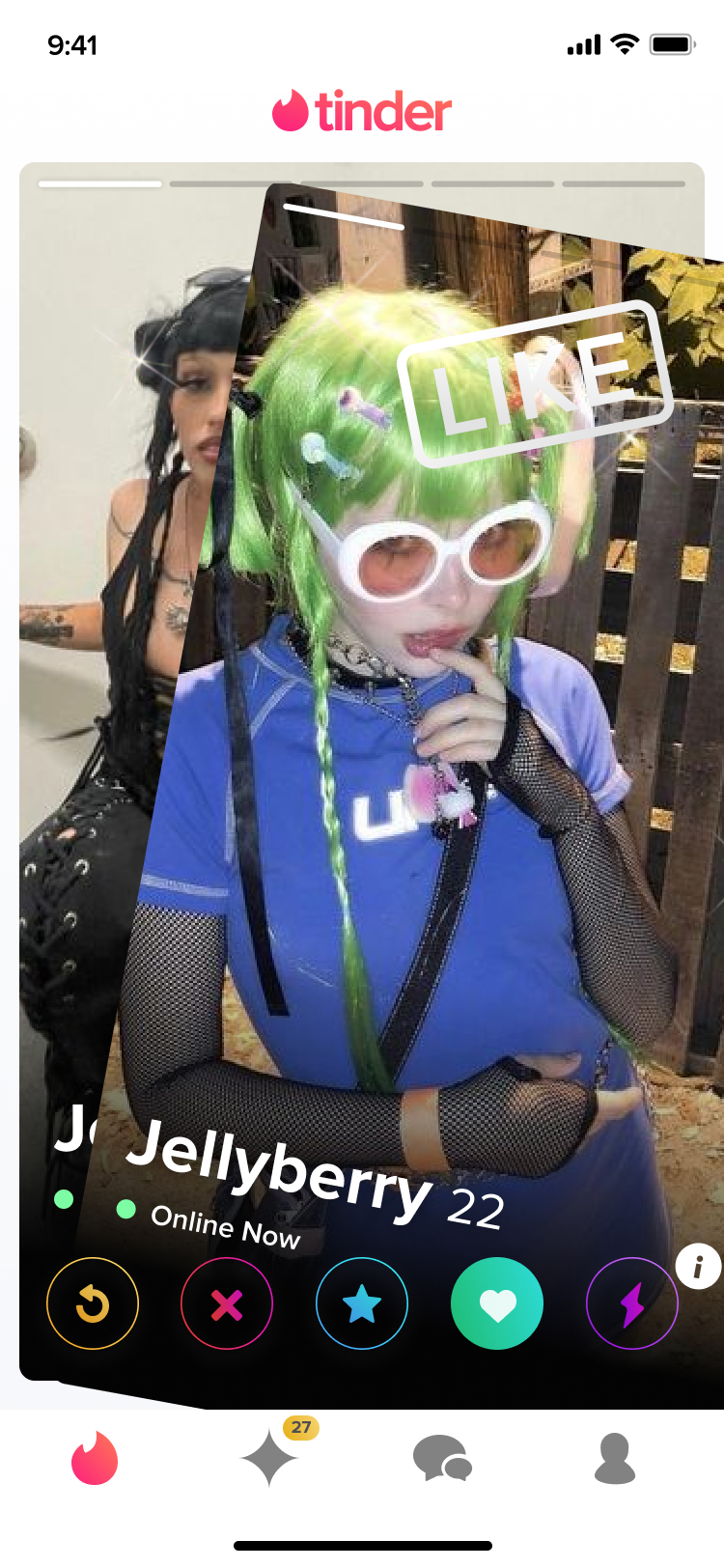
[We created premium branding for our Like Stamp to indicated the feature in action.]
We saw a significant increase in number of matches for Tinder Platinum users due to Priority Likes. We ran post-launch surveys to our subscribers, where this feature was top rated on a list of all available subscription benefits.
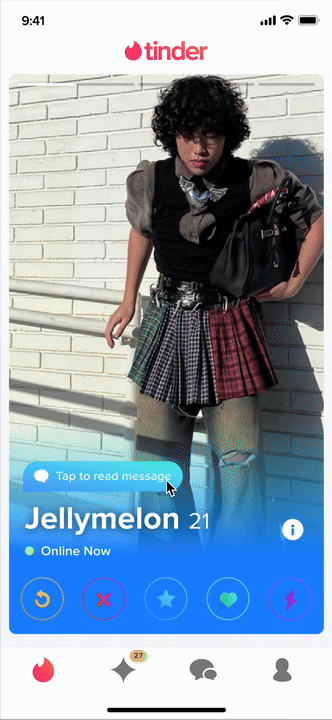
FEATURE #2 : Message Before Matching
Another key product that we observed our high intent users utilize was the Super Like feature. It provides higher visibility and has shown to increase a users chance of a match by 25%. Going off of this data, we added the ability for Tinder Platinum subscribers to attach a message to each Super Like that they send. This allows for personalization in the hopes that it would increase the chances of matching. There is also a perception amongst users that sometimes Super Likes are sent on accident, but this would show the senders intention by adding a unique message.
.gif)
[A pop-up appears after a user has sent a Super Like prompting to add a message]
[This shows what the recipient of a Super Like with a message would see on their Home Page and as they expanded the profile to see the contents of the message.]
This feature did not perform as well as Priority Likes, and we hypothesized this for a few reasons. Super Likes can sometimes look "thirsty" by some people and adding a message only made it look more try-hard, unless the message was very thoughtful! We also observed that while people are swiping on the Home Page they're moving very quickly. This feature slowed down their swiping and introducing the pop-up. Moving forward, we thought that it might be helpful to separate the messaging feature from Super Like entirely to avoid the association of trying too hard. We also thought that showing a preview of the message on the Home Page might make the recipient more receptive to the message instead of having to expand the profile to read the message.
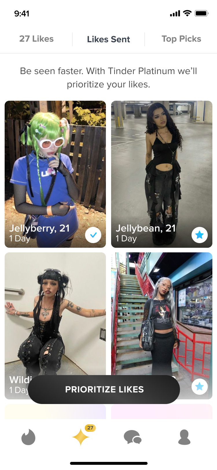
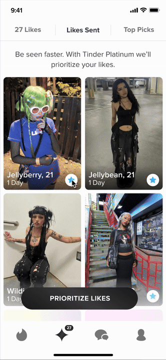
FEATURE #3 : Second Impression
First impressions are tough. So we wanted to give Tinder Platinum a second chance after sending an initial Like. We designed a new tab on the Subscription Page that allows subscribers to see the profiles they liked over the last week and send a Super Like with a message to increase their chances of getting a match.
[Subscription Page with a new tab called "Likes Sent" where a Tinder Platinum subscriber can send a Super Like with a message to anyone they already liked in the past 7 days.]
All in all we, saw huge success with Tinder Platinum subscription rates, match rates, and two-way conversations post-match. There are still ways to improve each of the features, as well as, introduce more white glove service features that users expressed would be valuable. Such as, profile reviews to help improve the quality of their profiles, being provided with stats around profile view numbers and which photos are liked the most, and messaging advice.
[PROJECT 2]
Subscription Merchandising Page
Users had expressed that they were confused about what the difference was between our subscription tiers and didn't know what features came with each tier. This led to them not knowing which subscription was best for their specific needs. With the addition of Tinder Platinum, that confusion only grew. To solve for this issue, we created a new way for users to view all of our subscriptions in a side-by-side comparison clearly laying out the benefits of each tier.

[Side-by-side comparison of Tinder Plus, Tinder Gold, and Tinder Platinum with a list of features included in each tier.]
We began by auditing all of our listed benefits and dividing them by subscription tiers. Then further categorizing them into coherent groups making it easier to digest all of the information. Then after categorizing the features we listed them based on importance as expressed by our users in surveys we conducted.
We saw an increase in subscriptions of our higher tiers and revenue after launching this project. An added benefit internally, was the proof that creating experiences focused on user education could have significant revenue benefits, as well as, customer satisfaction.
[PROJECT 3]
Swipe Party
An important part of finding the right match can be getting the approval of your friends. Based on interviews, we knew that people would often show their friends profiles they had recently matched with to get their opinions. We even heard that some users would allow their friends to swipe for them. Because of this, we created a novel feature for groups of friends to bring this experience into the app itself. Swipe Party would allow the host to invite up to three friends who could all video chat together while viewing the host’s recommended profiles. Friends could also send reactions to have an interactive role in the experience. This was also part of expanding the Explore Page to provide users with unique ways of swiping on Tinder based on their specific needs and goals. [This feature was only tested among a small number of users.]
[Swipe Party landing page and a full party with the host's video highlighted.]
[I explored a variety of branding options to try and capture the element of fun Swipe Party would be with friends.]
Peter:
Working at Headspace as a product designer was an incredible experience that I'll always treasure. During my time there I was involved in improving the user onboarding process, helping new users seamlessly get into a practice of mindfulness, developing a referral program to help acquire new users, and redesigning the home page, making space for new exercise and music content.
Collaborating with the brand team was a highlight too. Together, we crafted illustrations that perfectly matched the app's personality and worked on new visual approaches for the exciting content we were introducing.
My time at Headspace was all about enhancing user experiences and adding a touch of joy to everything I did. These experiences not only sharpened my design skills but also nurtured my passion for creating products that resonate with people. I'm so grateful for the chance to be part of such a dynamic team and make a positive impact on users' lives.This is some text inside of a div block.
[PROJECT 1]
Home Page Redesign
At Headspace, I played a pivotal role in a transformative project to revamp our homepage. With the expansion of our app's content library, which now includes meditation, sleep, focus music, exercise, and fitness content, we faced the exciting challenge of presenting these diverse offerings in a seamless and user-friendly way. To achieve this, I audited all content types, breaking them down into coherent categories that would resonate throughout the entire app. I also worked closely with the brand team to contribute to the creation of new icons and visual elements to represent these dynamic content additions.
The result? A refreshed and unified user experience that simplifies navigation while embracing our evolving content landscape.
We wanted the content to be easy to use for both new users with little experience in the app who might need help with content recommendation. But we also wanted experienced users to find these designs to be quick and easy to pick up where left off or revisit their favorite content.
Discoverabilty was also a key part of the redesign. We saw that there was a lot of content that wasn't being viewed by users but when we conducted interviews found out that they were highly vaulable to users. We wanted to highlight that content in our featured section at the top, as well as, by creating the Library section where we organized all of the content by categories.

[Showcasing the original meditation and sleep content in the new format.]

[Showcasing the new fitness and focus content.]